The Pantone Colour of the year for 2021 is… Two Colours!

For the second time in it’s 22 year history, Pantone has chosen not one, but two Pantone Colours, PANTONE 17-5104 Ultimate Gray + PANTONE 13-0647 Illuminating. The selection of this much anticipated hue is a feat taken on by a team of colour experts from the Pantone Color Institute, as they comb the globe for the colour that will dominate multiple industries’ decisions. Following thoughtful trend analysis, the chosen colours of 2021 is a response to the unpredictability of the preceding year, two independent colours that are emblematic of the manner in which different elements come together in solidarity. Gray as a symbol of a firm foundation, and yellow as a bright and cheerful sparkle of life.
“The union of an enduring Ultimate Gray with the Vibrant Yellow Illuminating expresses a message of positivity supported by fortitude. Practical and rock solid but at the same time warming and optimistic, this is a color combination that gives us resilience and hope. We need to feel encouraged and uplifted; this is essential to the human spirit.”
- Leatrice Eiseman, Executive Director of the Pantone Color Institute
The surge in home renovation also stems from a pandemic that has forced people to stay at home eyeing that corner they’ve been wanting to redecorate for years. We have reached out to a member of our Creative Directory for her take on the Do’s & Don’ts of incorporating the 2021 Pantone Colours into our living spaces.
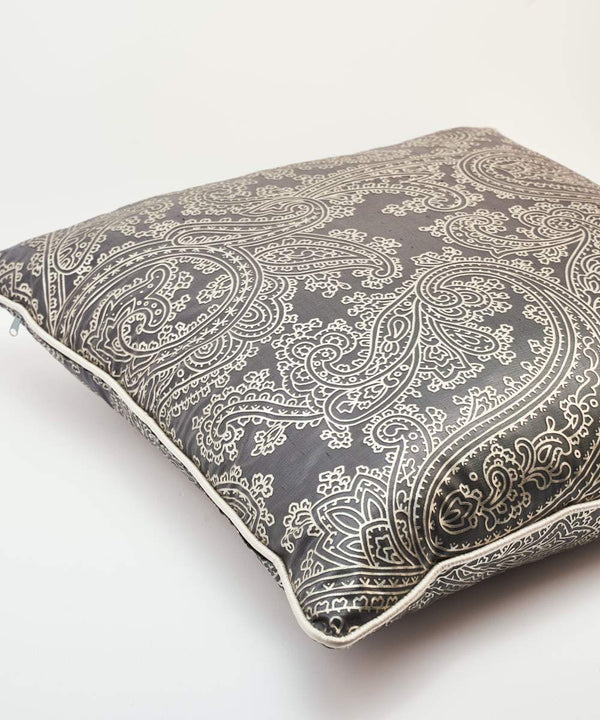
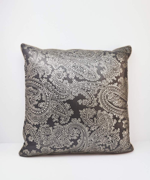
Ultimate Gray
DO'S:- Use as a wall color, It can warm up a room that has a lot of natural light. An example could be using it on 1/3 of the bottom half of a wall along with molding detail.
- Grey upholstery for the main pieces in a living room or even an upholstered headboard.
- Kitchen cabinets with some beautiful detailed brass handles.
- As a large rug.
- Mix this shade of gray with more cooler tones, instead mix in warmer, earthy tones and textures.
- Don’t use too much of this same shade in one space, gray can be quite dull and depressing. Try to mix in with monochrome pieces and accessories.


Illuminating
DO'S:- Use as an accent color in a space, yellow can be fun and uplifting.
- Use as a 3/4 color around a space that needs more light, as I have done in my recently revamped home office.
- Use as a highlighted edge to upscale a piece of existing furniture.
- Use as a base color for an oversized piece of art.
- Pair with white and a hint of black.
- Use too much of it, in the wrong proportions it can be.
- Use as a color for large pieces of furniture, the eye will tire of it.


Leave a comment